Branding for The Workmen’s Dwellings
The Workman's Dwellings building was originally built in 1910, though now have been transformed into luxurious and charming accomodation in an unrivalled position in the heart of Sydney. These buildings retain their unique heritage and history, providing a unique, industrial and classy stay.

The Challenge
- The Workman’s Dwellings needed a fresh new logo design that projects the message of the 1910 refurbished, luxury apartments.
- Keep a sophisticated, charming and luxurious feel to match the architecture.
- The Workman’s Dwellings aims to have a design that will last long term.
Our Solutions
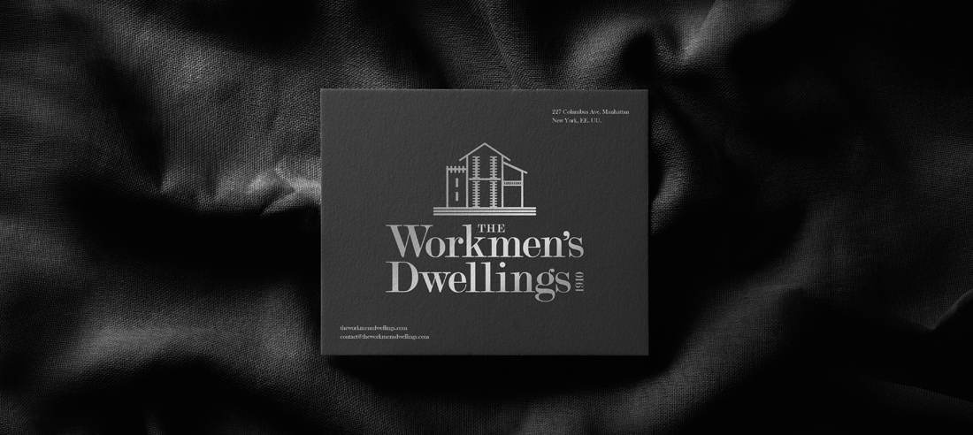
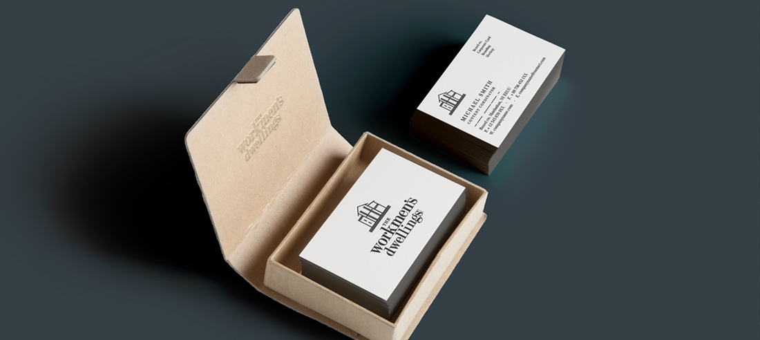
- The Workmen’s Dwellings logo design features a stylised illustration of the actual building in Sydney.
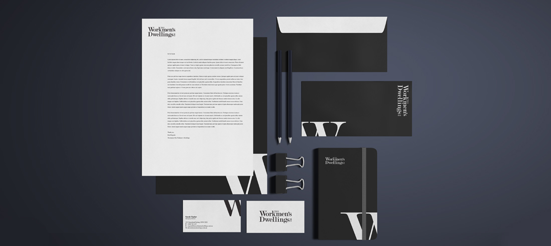
- The look and feel is simple, featuring a very minimal colour palette and a modern serif font choice. This allows brand to stay classy, timeless and bring out the most of its heritage roots.
- The Workmen’s Dwellings colour palette is very minimal with Black and White as the primary choices and pops of metallic silver when needed.
- The main The Workmen’s Dwellings logo can be reversible, used on light and dark backgrounds.


