Branding for Version Two Collective
Client Name:
Version Two Collective
Services:
The Version Two Collective are hired to help employees transition into a new job or career. Version Two Collective is a team that helps clients transition into their 'version two', positively and warmly guiding them through this new journey with confidence after being made redundant.

The Challenge
- Version Two Collective branding needs to be a warm and professional logo design that displays the concept of the company.
- The client wanted to convey warmth, which is why orange was chosen as a key colour.
- Version Two Collective needed a clean, modern logo but also has to be injected with personality to represent their point of difference.
- The company stated they were open to suggestion for further design concepts.
Our Solutions
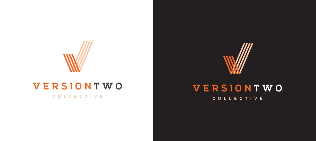
- Version Two Collective’s branding has been designed as an orange abstract ‘V’ logo and to represent a tick mark.
- Combined together, the icon implies positiveness and assertiveness.
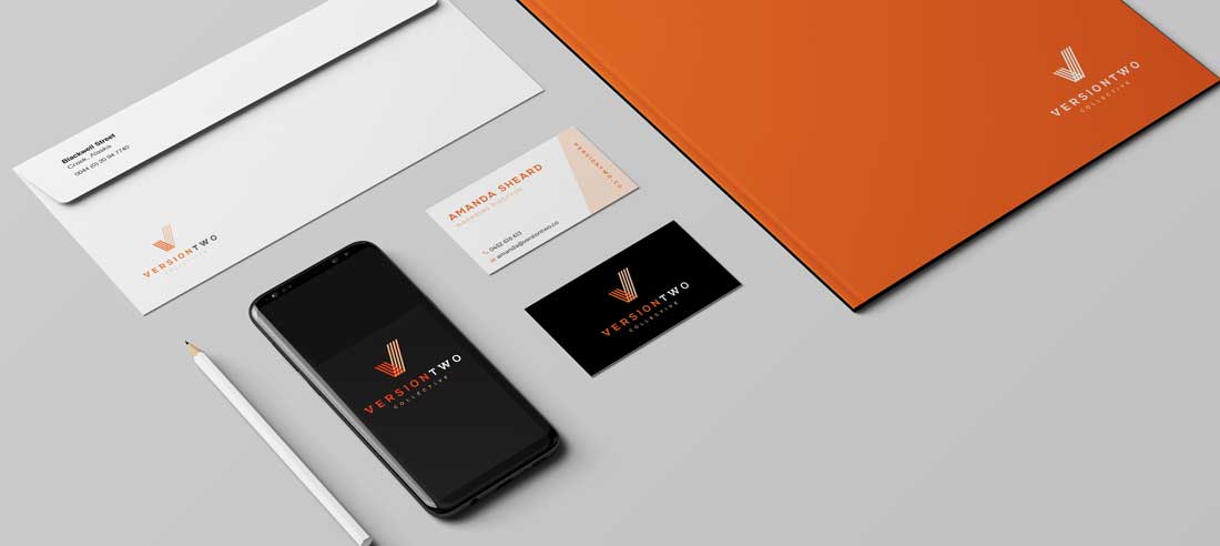
- The design is clean and crisp, effortlessly blended with a modern choice of typography and colour palette.


