Logo & Branding for Stone Set
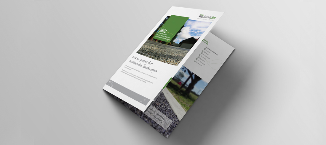
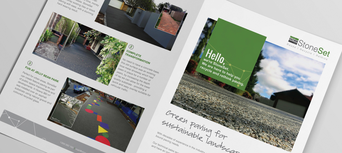
Stone Set is an established market leader in creative paving products with a strong focus on working in an environmentally friendly way

The Challenge
Stone Set wanted the logo to appeal to an architect and be in touch with their technical design and drawing industry. They were looking for a balance between technical architecture appeal and green feel.
Our Solutions
Logo solution:
The graphic design team were able to deliver a logo that displayed the business name in a trendy fashion, whilst representing the professional nature of the client. The colour combination of the greens and greys used present the brand in an inviting manner and portray the importance of sustainability to the business. The core messages of the client Reuse, Recycle, Rethink are placed under the imagery and business name to reinforce the brand image.
- Colour scheme and fonts used connect with Stone Set’s target market – architects in Sydney.
- The tag line Reuse, Recycle, Rethink promotes Stone Set’s sustainable business practices for a competitive advantage.
Branding solution:
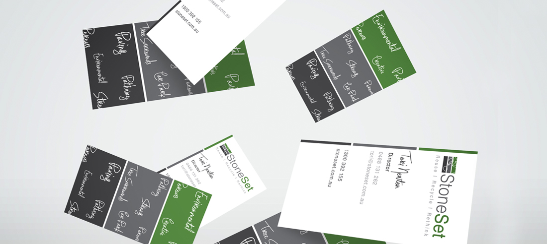
After continual conversation with the client, our team were able to deliver a business card that highlighted information such as their core business beliefs: re-use, recycle and rethink paving. On the back of the business card the graphic design team used trendy text to convey the values of Stone Set, using text such as creative, strong, paving, environmental and porous. The design incorporates the recognised colours of stone set; green, grey and white, in order to integrate the business cards with other marketing techniques used by the company.
- Design incorporates the recognised brand imagery of Stone Set for continuity of promotional activity.
- Prints use eco-friendly paper to align with Stone Set’s sustainable vision.


