Branding for Venation Landscapes
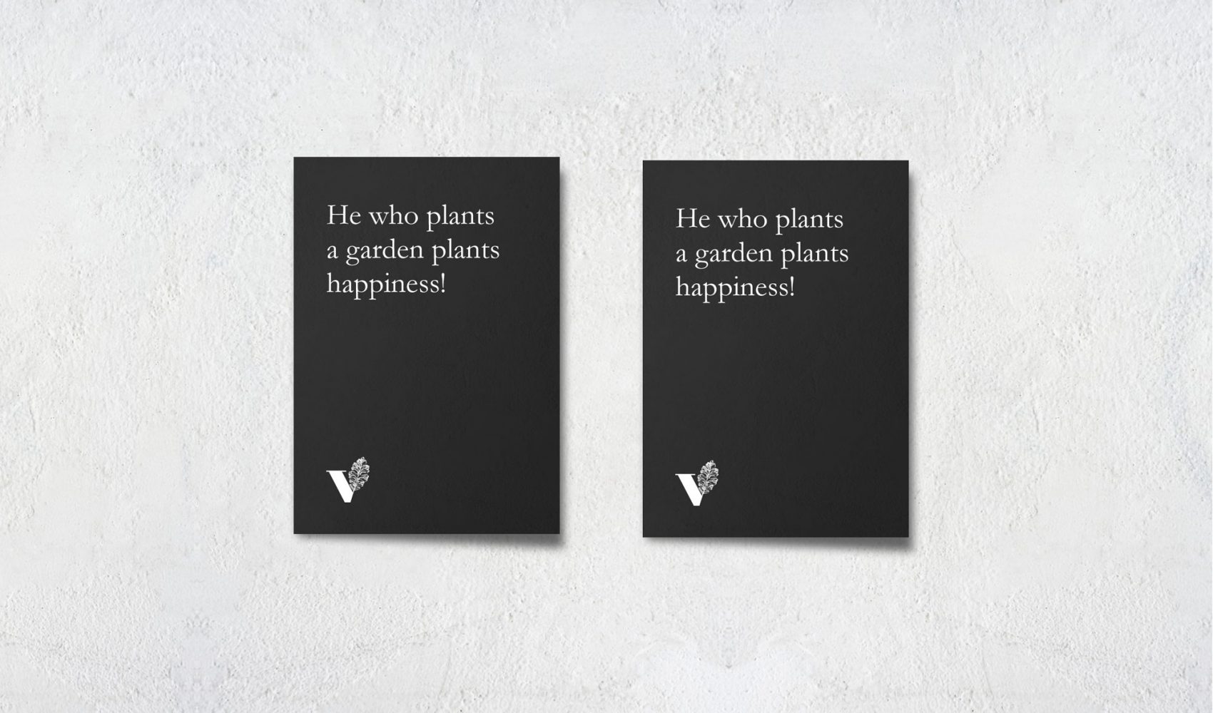
“He who plants a garden plants happiness”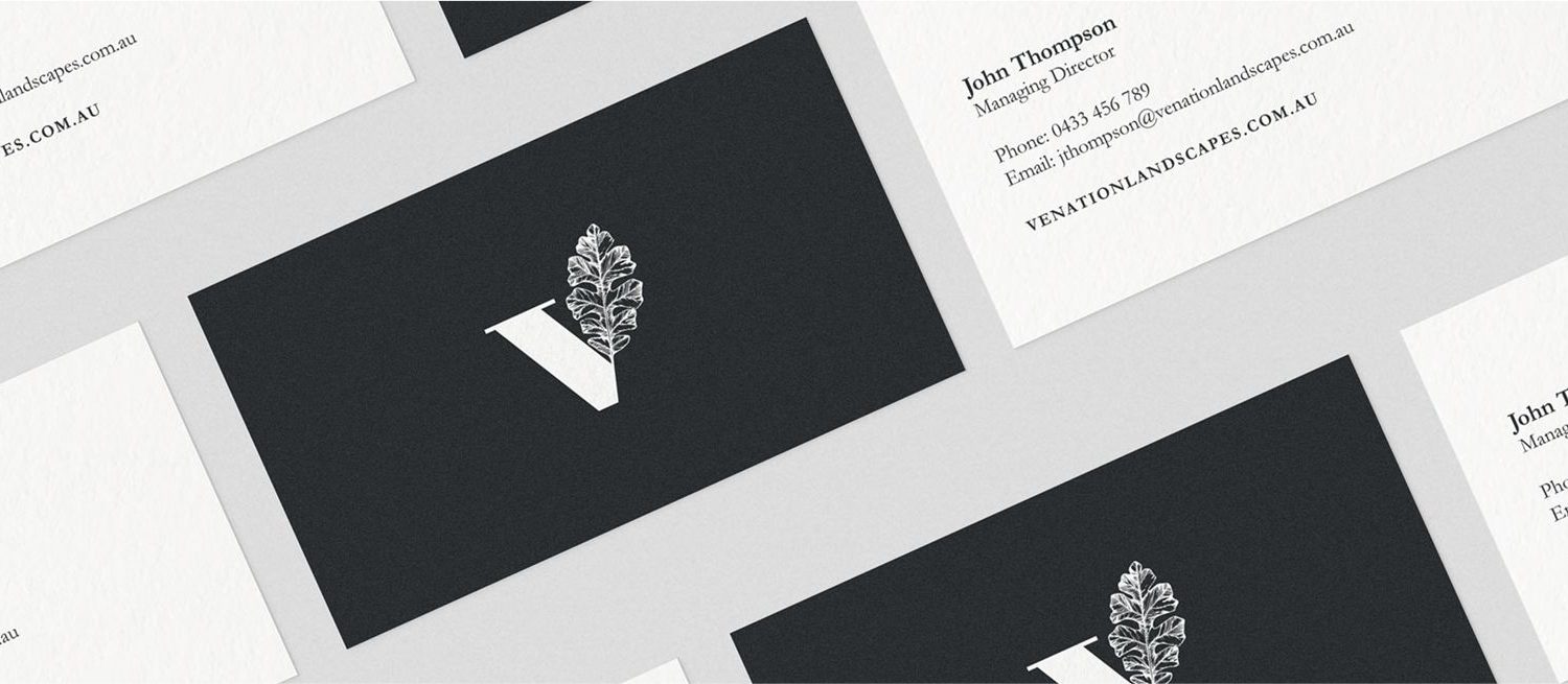
With a focus on simplicity, The Venation Landscapes works within the residential sector as a designer for gardens that compliments the architectural lines given by a building. Blending styles from English, French, Italian to Tropical and Organic.
The Challenge
- The Venation Landscapes aims to attract high end, residential clients.
- The Venation Landscapes website needs to be classy and sophisticated.
- Venation means veins on a leaf, so the incorporation is vital for design.
- Venation Landscapes wants a logo that will evolve over time and remain on trend.
Our Solutions
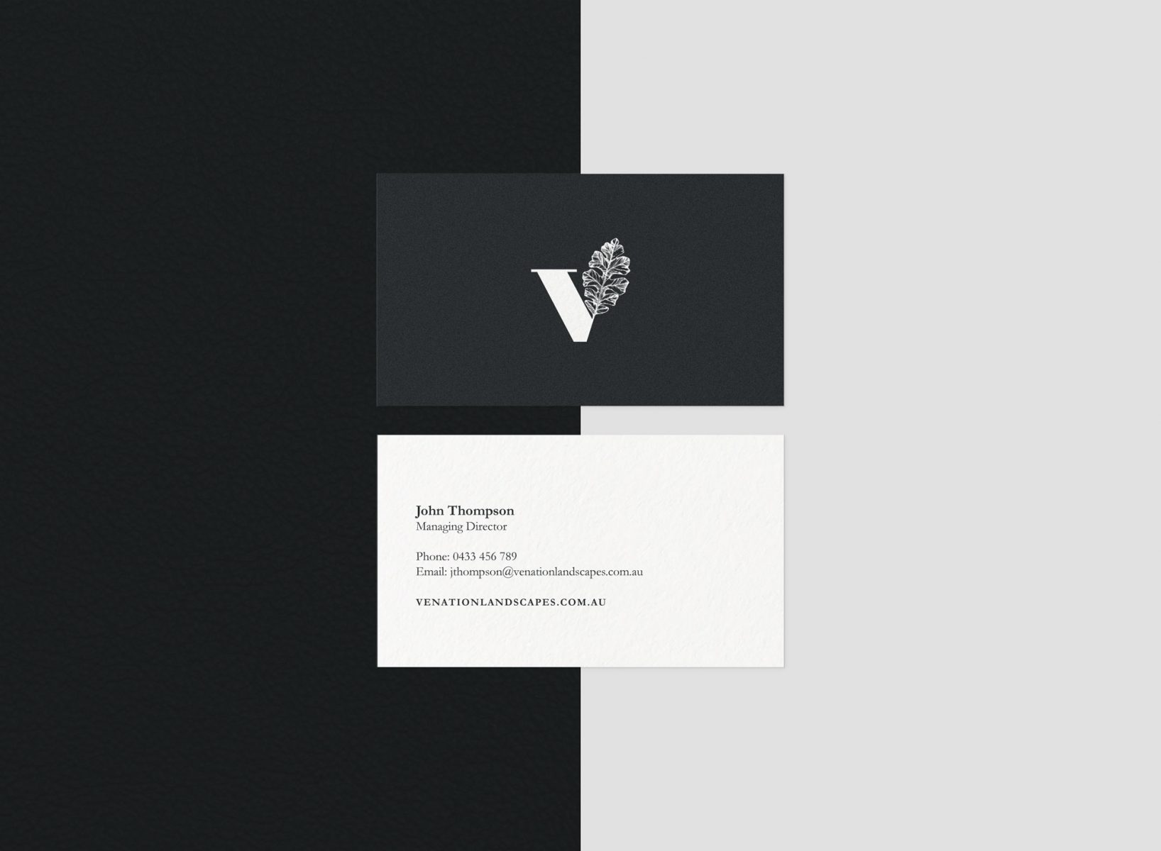
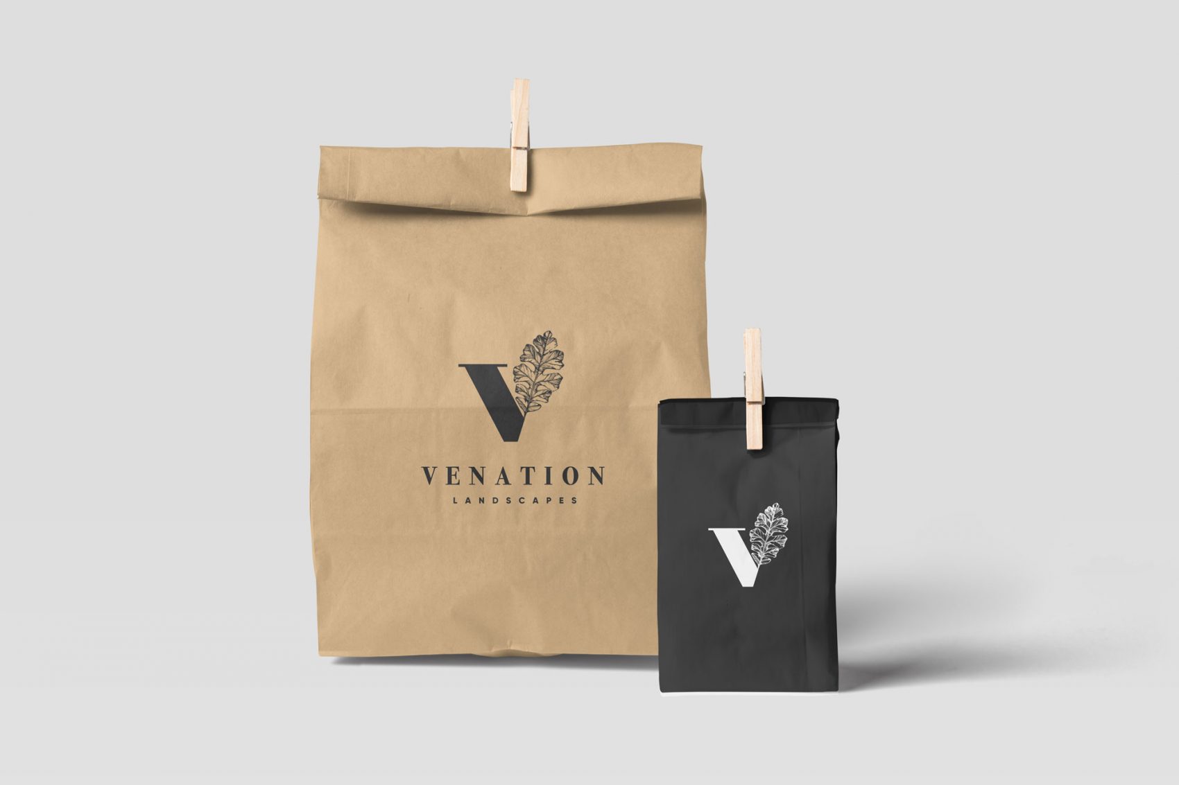
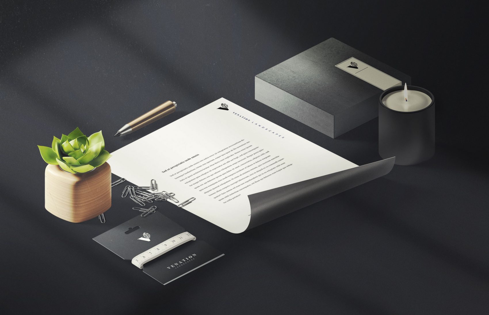
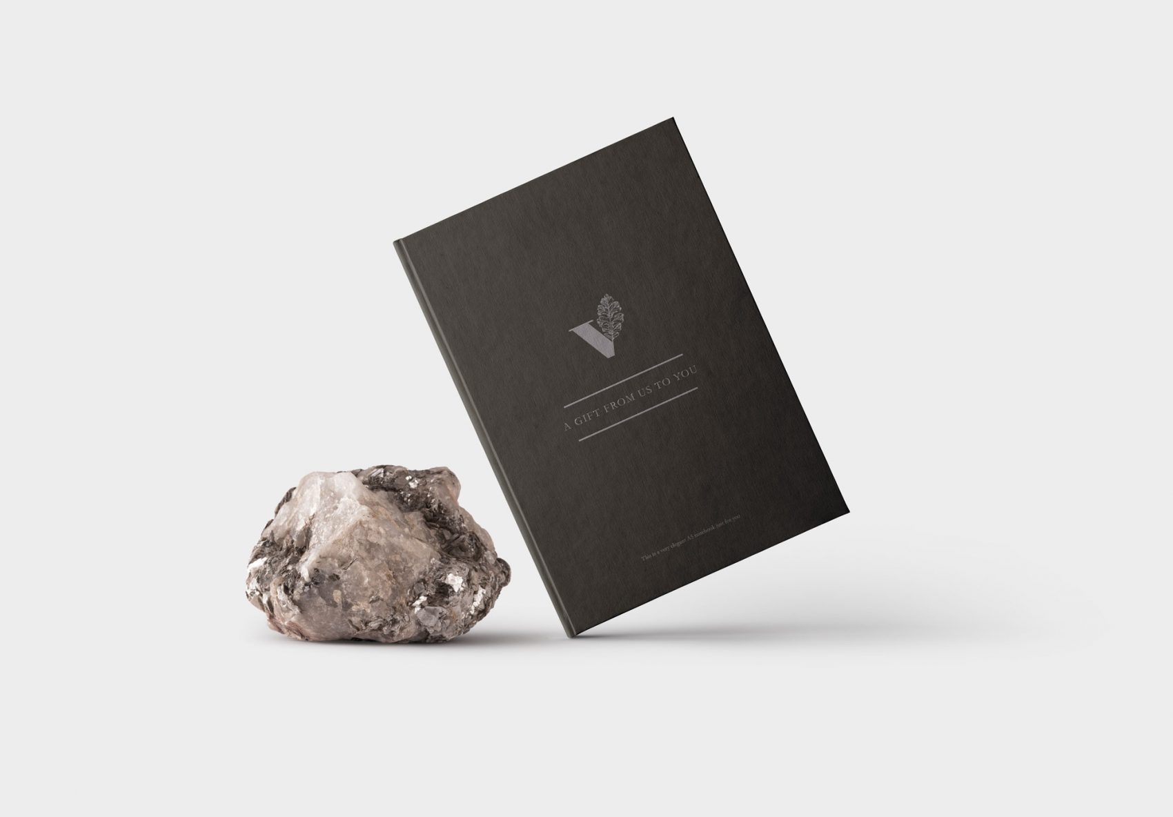
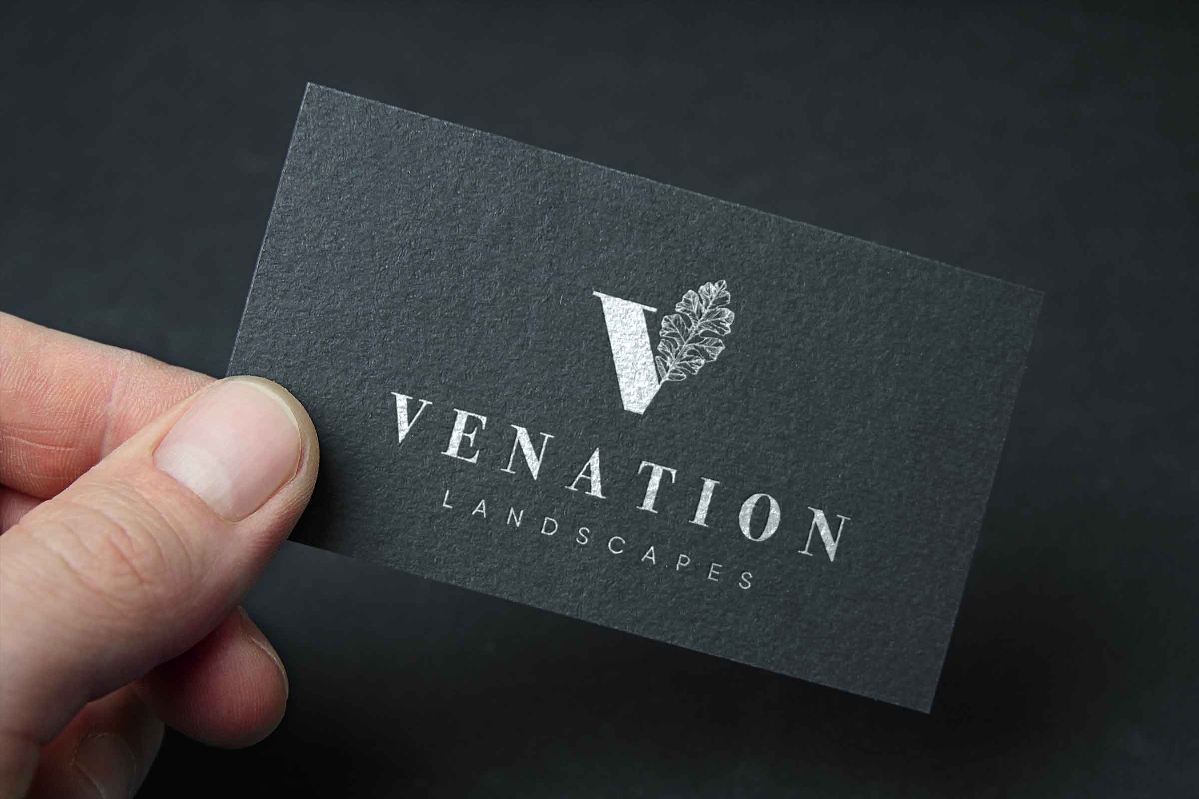
- The Venation Landscapes logo features the intricate icon of an oak leaf, forming into part of the letter ‘V’, which gives the brand the an air of style and uniqueness.
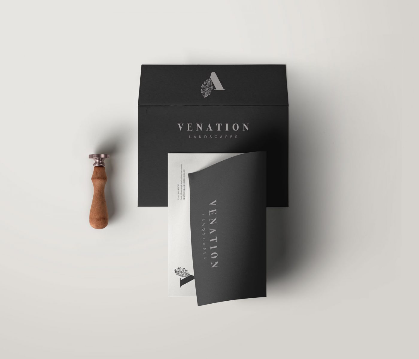
- The minimal yet contrasting use of colours points to a sophisticated yet creative brand and personality.
- The Venation Landscapes colour palette has been created to reflect the high end and sophisticated spirit of the brand, featuring primarily navy blue and black.
- The main Venation Landscapes logo can be used across all materials that have a light coloured background.
- The logo can be reversed and used on dark coloured backgrounds too.
