Spicy Panda Says… Less is More
COMIC 02 – PANDA SAYS… LESS IS MORE
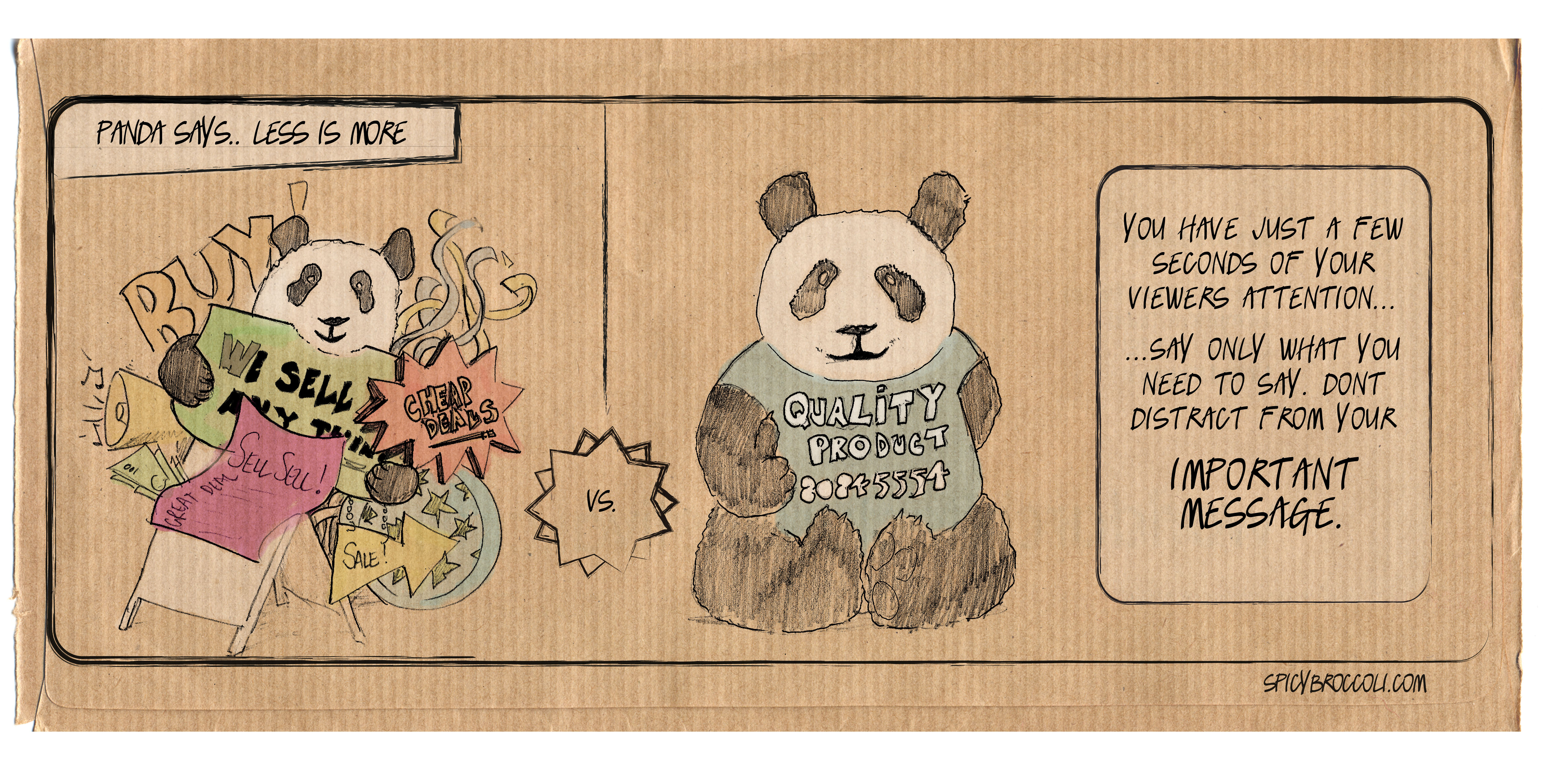
Viewers only have so much attention to give, so you need to simplify your overall message to the one thing you do best. It can be tempting to add every bell and whistle to your website/business card/brochure and fill every space with something about what you do. But doing this can actually be ineffective, and can distract from your overall message.
When dealing with us at Spicy Broccoli Media, or other designers – we’ll talk about using white space. White space allows for easier scanning of a website. It reduces the amount of text visitors see all at once and makes reading much easier. It allows for the visual separation of design elements without adding any new elements such as visible lines or boxes. It is clean, looks professional when used correctly, and gives a site an uncluttered and fresh feel.
At the end of the day, you want the viewer to capture your message in the first few seconds of seeing it. If you clutter your message with colours, and other elements you’re going to distract or lose the viewer. If it’s clean and simple and simply says “This is what I do” – you’re going to keep them long enough to make them what to know more about your business.