Website Design: The Do’s and Don’ts (psst we’ve got a new website!!!)
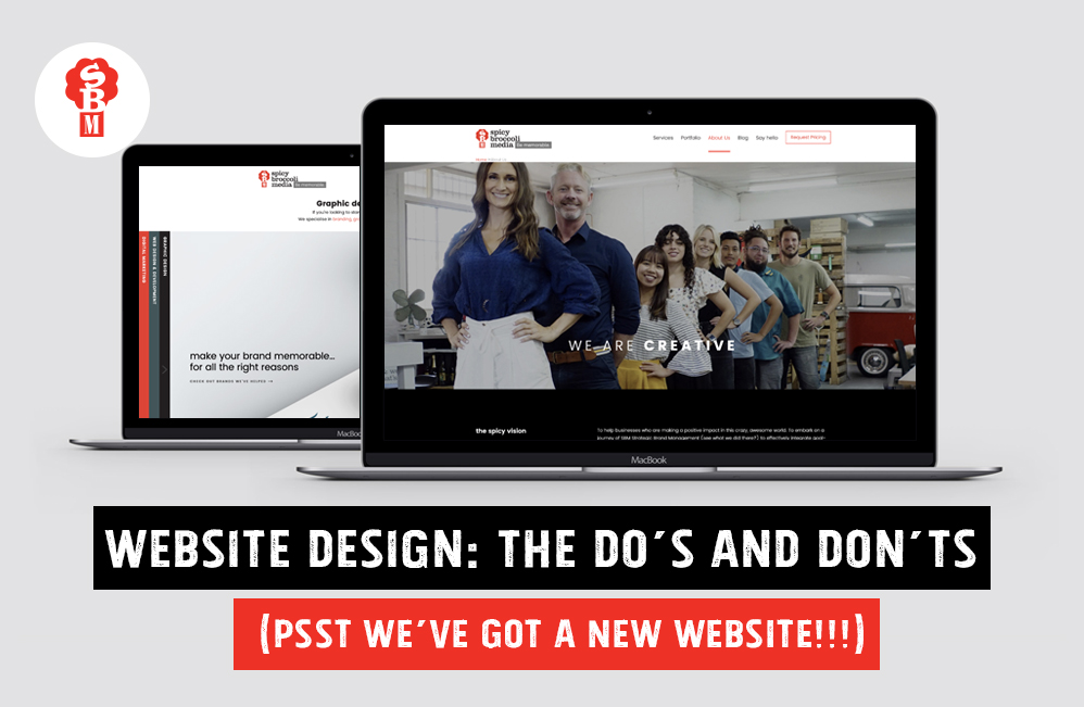
In the spirit of our new site launching – yes you heard that right, we have a new website WOOP WOOP! And it looks pretty damn schmick if you ask us 😉 We wanted to share a couple of to do’s and not to do’s about website design.
User Navigation
Don’t: create a cluttered or confusing layout.
There is nothing worse than clicking into a website and being confused about where to go next.
Users often leave web pages in 10–20 seconds, but pages with a clear value proposition can hold people’s attention for much longer. To gain several minutes of user attention, you must clearly communicate your value proposition within 10 seconds.*
This is why a well-organised layout is crucial, it guides the viewer where to go and how to keep them engaged in all the content you have worked so hard to create.
Do: create clear navigation with a focal point.
Your visitors are viewing your site with a clear objective, whether it be your products, services or knowledge. Having a navigation bar at the top of your website with these key focus points allows the user to quickly scan for the information they are searching for. Our focal points are our services and portfolio, where potential clients can see what we do and how we’ve done it for other clients with a very clear ‘request a quote’ button for them to take action when they feeling inspired 😉
Colour Scheme
Don’t: use all the colours of the rainbow.
Have you ever heard of colour psychology? It has a huge impact on the way humans perceive things. Colour is a powerful communication tool that can affect our mood, feelings and emotions, therefore can effect a viewer’s opinion of your brand.
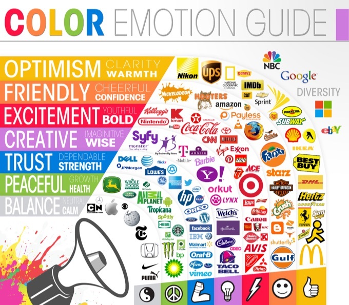
Do: use a colour palette that enhances your brand and what you want to communicate.
Spicy uses the strong colours of black, white and red. The red creates a striking powerful presence. The rest of the colour throughout the site comes from mockups of all our awesome work, so even though it does look quite colourful, there is a purpose to it. We haven’t gone crazy with our Pantone colour fans. Not yet at least…

Text Placement
Don’t: fill the pages with loooong boring paragraphs.
It can be easy to get caught up in writing anything and everything you want visitors to know about your business. But this creates clutter and makes it look a bit like, well… word vomit. A good copywriter knows how to communicate in clear, concise language.
Do: make it easy for the viewer to leisurely scroll through (think of it like a coffee table book)
If your pages are interesting to skim through then you have a better chance of visitors scrolling right to the bottom. As well as high-quality writing, use headings, bullets and quotes to make it exciting. At Spicy, we’re a bunch of creatives with all different kinds of bright personalities, so we like to put that personality into our online presence as well.
Fonts
Don’t: Use too many fonts.
Any website that uses five different fonts immediately looks chaotic and unprofessional. You don’t want to use too many fonts and look like a primary school student’s assignment when they’ve just discovered WordArt on PowerPoint…
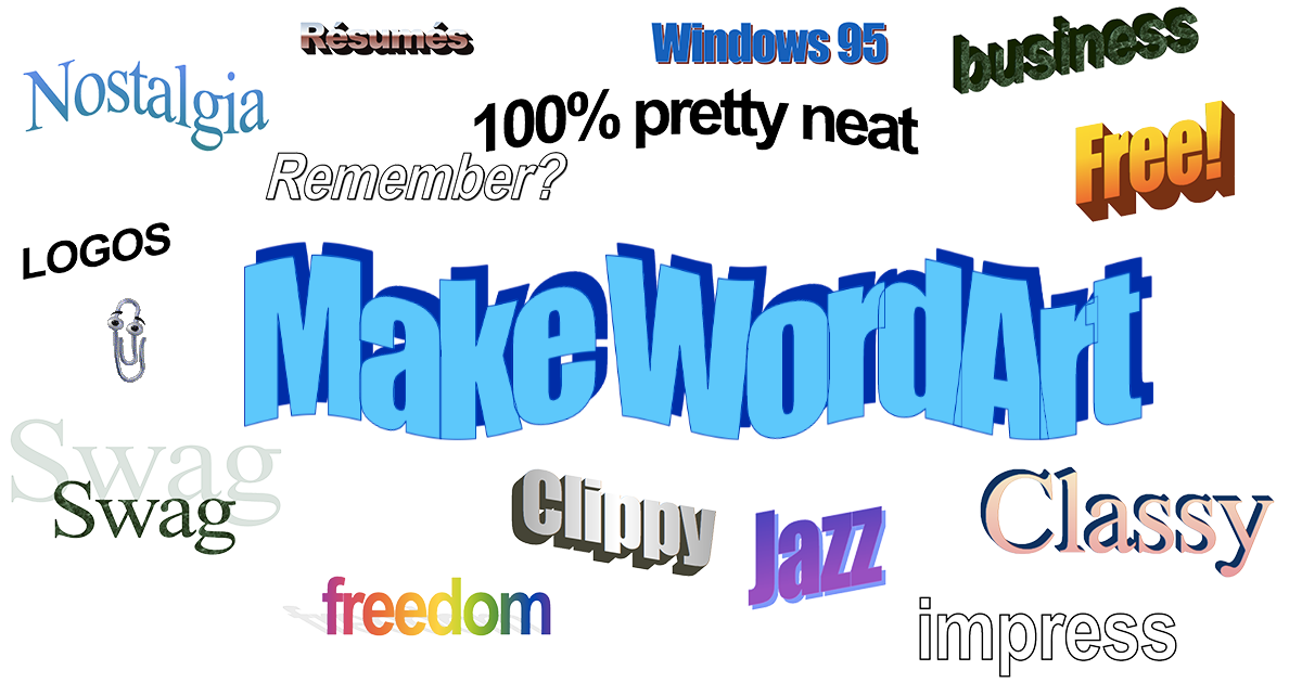
Do: stick to a few fonts with the right sizes.
An ideal number of fonts is two or three, the same font for headings, sub-headings and body text. It’s also important to also think about text size, too big can take up too much screen space and too small can be uncomfortable to read. The sizes should reflect the importance of each section. E.g. titles and taglines are more significant than body text, so they should be bigger. This also helps the reader to easily scan the content. We use the same font for all body copy and then another for all titles in lowercase.
Images
Don’t: Overload your website with images.
Too many images will drown out your message. If you’re using a background image, make sure to keep it under 1MB because:
hot tip alert: large images slow down your sites loading time.
Do: use images to make your site visually attractive.
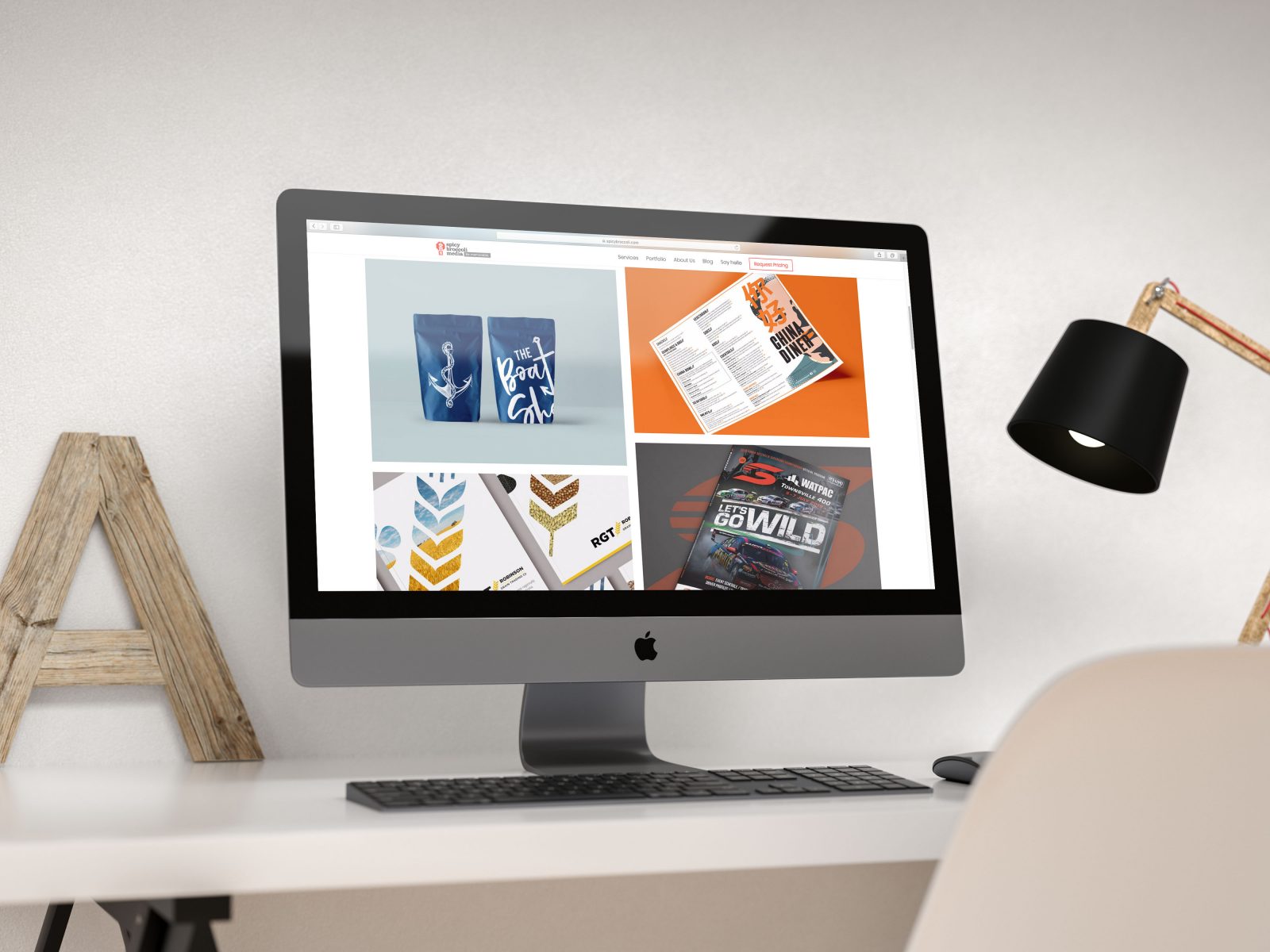
Use images for impact! People think visually, so a great image is super effective. Find images that are high resolution and not pixelated and reflect your brand’s personality. Throughout our site, we use all of our own images so every image has a purpose. No pointless stock images taking up precious page space! We have staff pictures and images of our work as high quality mockups in our portfolio and as examples on pages.
Mobile Compatibility
Don’t: Forget to optimise for mobile.
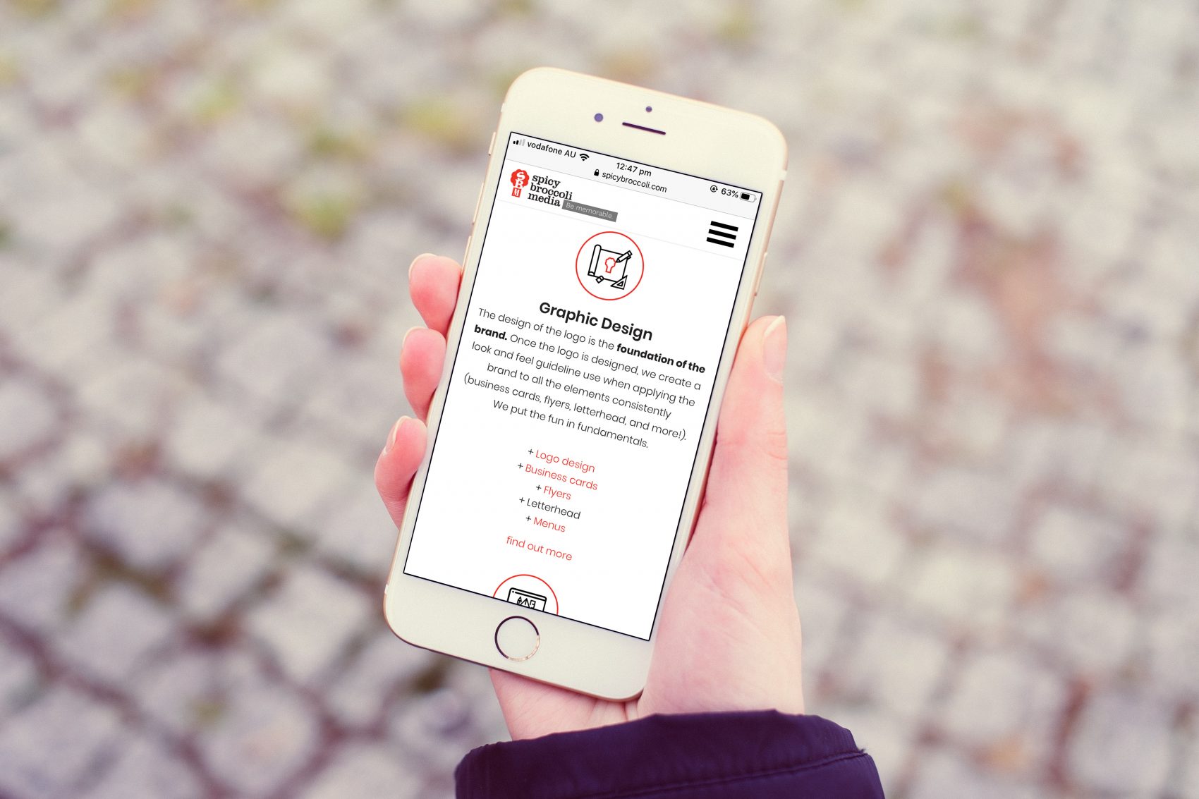
Everyone uses mobile. Every. One. So there’s a pretty huge percentage of people that are viewing your site on their phone, perhaps you’re reading this right now on your phone? Most people expect websites to provide great mobile experiences so it’s worth investing in responsive, mobile-first design.
Do: Test it for functionality.
Your website looking good on mobile is one thing, but it also has to function well too because otherwise what’s the point… Your mobile viewers should be able to do every thing desktop viewers can do too. Give them a search function, store locators, product/service details etc. If you view our site on mobile you’ll see the layout is optimised for a smaller screen so everything can still be viewed comfortably and the navigation bar helps you move around the site without having to zoom in.
Ordinary vs. Unique Design
Don’t: Ignore what works.
People are used to certain structures and formats on the web. This familiarity makes it easy for visitors to figure out who you are and what you offer.
Do: Be creative and memorable!
You still want to rise above the noise with uniqueness and creativity. Don’t be afraid to experiment with moving images, video or other design elements.
And there you have it! Some of the Do’s and Dont’s about website design from the experts. If you haven’t already, make sure you check out our new website here and give it some love!
Wondering how we can work some of our spicy magic to your own website? Contact us at info@spicybroccoli.com, or give us a call on +61 2 8084 5554!
*data collected from: https://www.nngroup.com/articles/how-long-do-users-stay-on-web-pages/
