Top 5 Graphic Design Trends for 2019 // Plus bonus!

PUN ALERT:
Two puns met in Rome, one said to the other, “Hey are you Roman?”, to which the other replied, “No, I’m Italic!”
From the revival of old school fonts to the growth of new tools and applications, staying on trend and understanding how styles are evolving keeps your work fresh and up to date. Here at Spicy Broccoli we have compiled our predictions for the biggest graphic design trends for 2019! In case you want to revisit last year’s graphic design trends, click here!
A prediction on design trends for 2019 from our Spicy Director Sarah Taylor
“In 2019 I’d like to see design trends explore more hand-drawn typography and graphics integrated into a minimal style. You can never go wrong with clean and simple, and to bring out the personality mixed with a little edge I think will be a winning combo”
1. Bookman and Old Style Serifs:
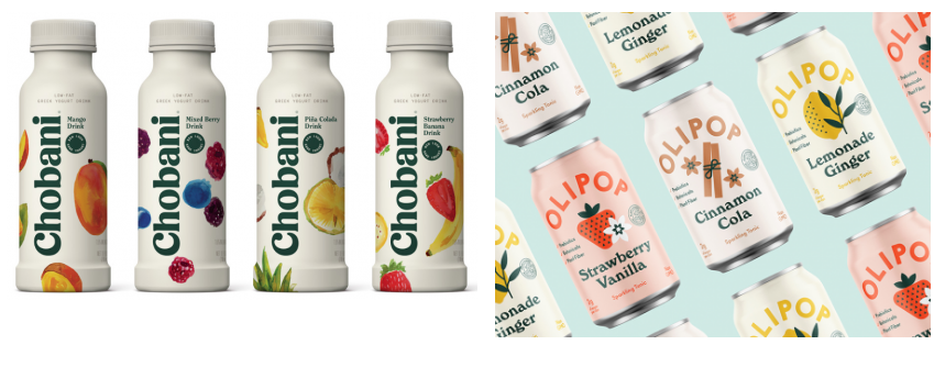
Hold onto your tophats! Brands are going back in time with these playful serif (fonts with the little feet on the end) typefaces. One of the most effective ways to communicate as a brand is by using beautiful typography in your designs. The use of creative and on-trend fonts is essential for making a visual impact, conveying your message and evoking emotion from your audience. You’ve heard of the saying “what comes around, goes around,” right? Well, trends of the past always come back into fashion. So, there is no surprise here that this cycle is happening in 2019, with fonts imitating and recapturing past typography trends. Bring a classic touch to our modern world with oldstyle Serif fonts.
2. Sustainability and Eco-friendly Packaging:
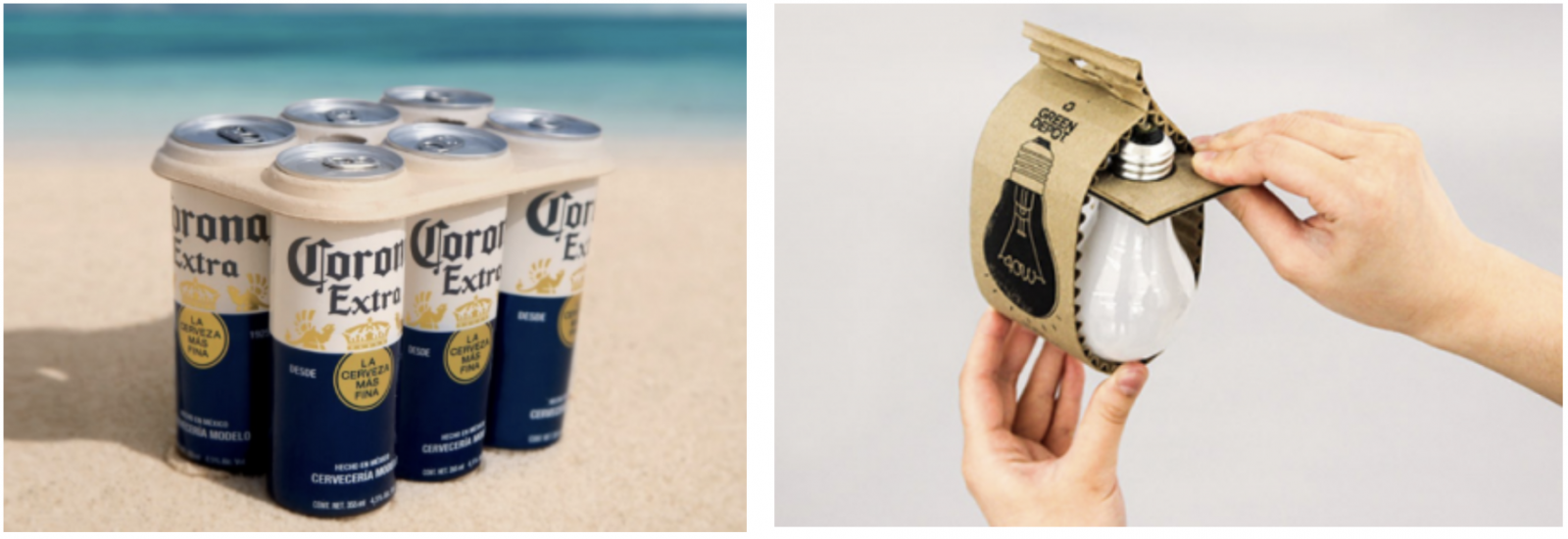
Finally! Brands are having to reduce their use of plastic, so environmentally friendly packaging is a big trend. Here at Spicy HQ we aim to be as waste free as possible (#wastefreewednesdays, duh), following the rule of the 3 ‘R”s – Reduce, Reuse and Recycle. Eco packaging is becoming far more important to todays consumers, so designers better step up their ecological game. Using less plastic and more innovative packaging materials allows for new and unique designs to be created in 2019. What could be better than an ice cold, refreshing bevvy at the beach on a summers day? (Correct Answer: An ice cold, refreshing bevvy *packaged in environmentally sustainable material, that still looks cute* at the beach on a summers day.)
3. Memphis:
Believe me, I like a neatly aligned grid just as much as the next OCD guy, but this trend is still on point. The Memphis design trend is a stand against grid formats.
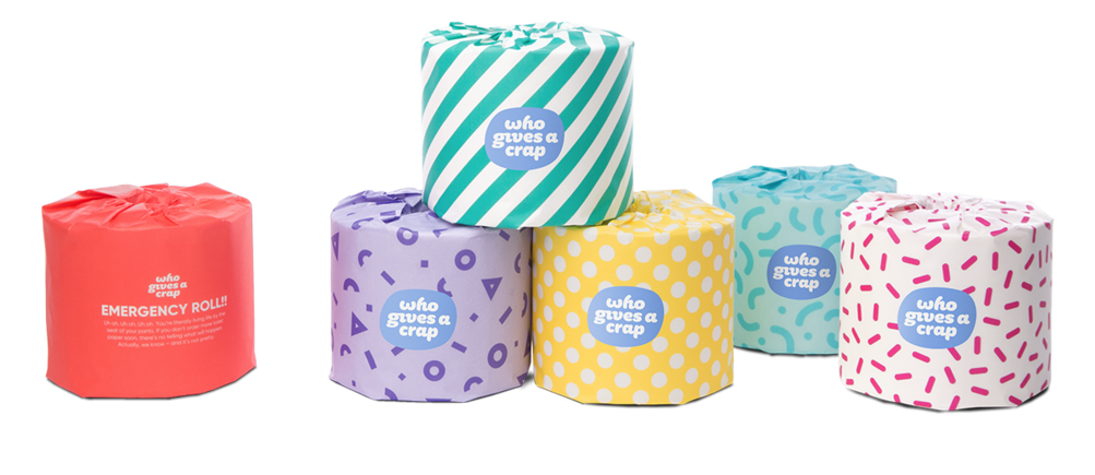
It creates patterns that are reminiscent of Pop-Art and ’80’s. The resurgence of Memphis design has embraced a somewhat chaotic, free-spirited approach to backgrounds.
The brand Who Gives A Crap not only makes trusty toilet paper with Memphis inspired design packaging but does it for a great cause! After learning that 2.3 billion people across the world (about 40% of the population!!) don’t have access to a toilet, Who Gives A Crap donates 50% of their profits to help build toilets and improve sanitation in the developing world.
4. Isometric Design:
Although this was definitely a trend we saw grow in 2018, we believe that in 2019 the realm of three-dimensional design and illustrations with vibrant colour palettes will continue to be explored. We expect to see more isometric illustrations combined with large typography, creating funky fresh compositions!
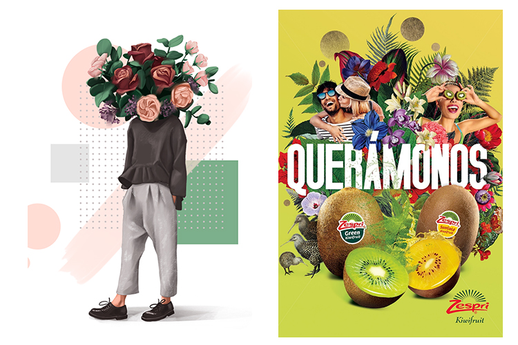
5. Modern Collage:
Combining different mediums like photos and vectors to create visually interesting montages. Paper collage has been around for centuries though today’s digitally-made photomontages and collages offer a new way of exploring the technique. Left: Inside Out, Right: Patrick Boyer.
Bonus! Hot Colours
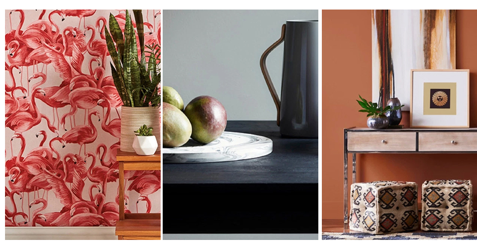
Pantone — a company with a proprietary matching and labelling system widely considered the global authority on colour — named Living Coral, a vibrant orangey pink, as its Colour of the Year for 2019.
Who says grey has to be boring? Benjamin Moore’s colour of 2019 is a subtle hue that taps into a desire to drown out the world’s cacophony. Metropolitan is a calming, versatile neutral with cool undertones.
The earthy, sun-kissed, and classic, Sherwin-Williams’ 2019 colour of the year is inspired by the American southwest. Let Cavern Clay be the cornerstone of your palette: It’s a flexible hue that pairs just as well with bright pinks and peaches (hello, Living Coral) as it does with muted yellows and cooler shades like Metropolitan.
At Spicy HQ we love seeing new trends evolve and experimenting with new techniques, incorporating them into our work. Check out our Portfolio on our website to view all our previous work, incorporating trends of the time.
Want to know more? Get in touch with us on our Contact Page,
send us an email at info@spicybroccoli.com ,
or give us a call on +61 (02) 8084 5554!
