Trending: Single Page Websites
Are you endlessly wondering what website style is for you? If simple, modern, and mobile friendly designs are your wheelhouse, then Spicy Broccoli has the answer for you!
We like keeping up to date with goings ons and design trends. So today, our Sydney graphic design firm brings you a popular mobile-friendly website format: the one-page endless scroll site!
These websites shine in their simplicity, using their design aesthetic and scrolling flow to get you to move around and interact with the website.
The sites work well, both on a computer, utilizing screen sizes for a more engrossing experience, with designs generally extending on all sides, as well as a mobile device (mobile/tablet), utilizing the devices scrolling touch screen, and one page design as an easy way to navigate even on a small screen.
There are, sadly, no guarantees in life; and while we can assure you of the one page site’s coolness now, in a couple of years it may go the way of your mother’s bell-bottom jeans, being replaced by another design trend. Limited space may be another con for those with a lot to show or say. The website’s style doesn’t cater as well to lots of content, and runs the risk of looking heavy and tedious, as viewers can only scroll for so long, especially on a mobile. Endless is more of a moniker than an actual design suggestion. . .
However, if a modern, simple, low – medium content, mobile friendly site is what you need, the pros generally outweigh the cons. When the trends do inevitably change, the website’s simplicity is easily changeable and can be built upon to be on par with whatever is next. Of course, trends do tend to come back; if you wait long enough the endless scroll will be in again, much like those bell-bottoms.
Now for the visual portion; here are some of our favorites:
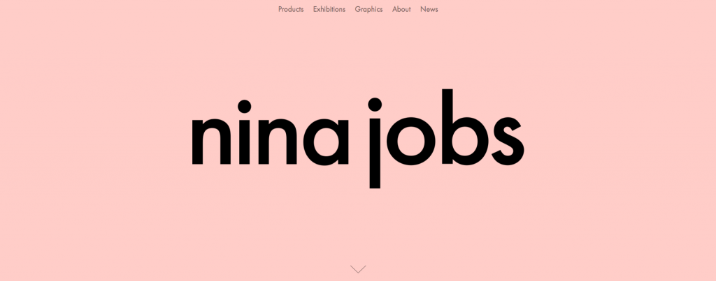
Nina’s site uses up/down AND left/right scrolling! Talk about going above and beyond. We love her minimalistic design aesthetic, and simple navigation: either scroll up/down at your leisure to view each section, then left/right for it’s contents, or pick a specific section from the header navigation and be instantly transported to that area on the page. The website translates flawlessly to mobile, using swipe scroll and big left/right arrows to navigate around.
bevisionare.com
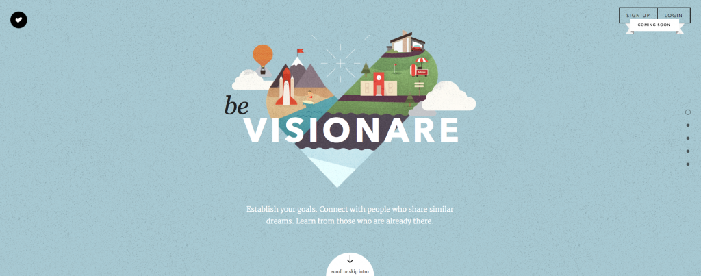
Visionare is an adorable and fun site using up/down scroll and pop-up animations. As you scroll, the site takes you on a little journey, stopping at certain points for animations, introducing the company’s message. It does a great job leading you where you need to go, and it’s a fun ride. The mobile site omits the animations, but the flow is just the same, using swipe scroll in all directions to translate the site for a mobile format.

Iutopi uses up/down scrolling, geared to take you deep down into their website and it’s ocean design. The site has a sliding, overlapping design, with parts moving at different speeds in relation to you scrolling, working perfectly with their ocean and submarine theme, giving you the allusion of really descending into the ocean. Passing sea life, and an ever increasing sea level counter the deeper you go, are fun additions we just love! The mobile site, while simplified, uses swipe scrolling and the original site’s theme to still give you a sense of being at sea, while dishing out the important info.
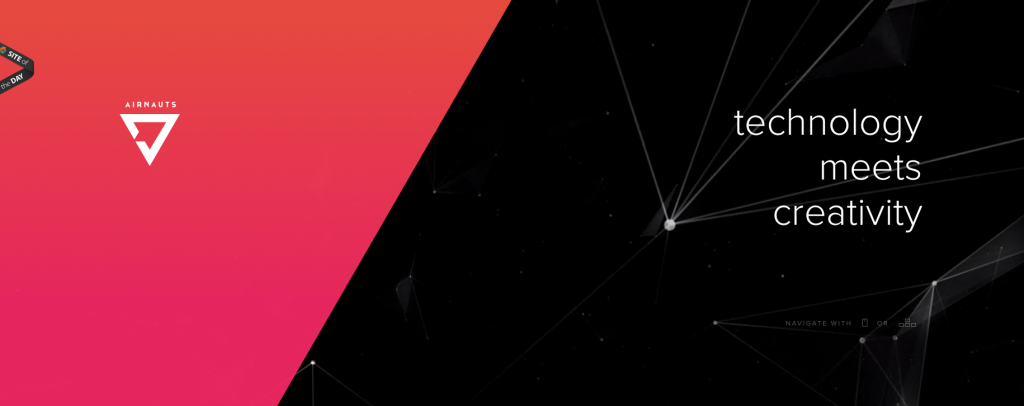
Last, but not least is Airnaut’s space themed site. It uses scrolling in an interesting and different way on the top part of it’s site, using it to control a waxing/waning diagonal sectional, almost like a growing sunbeam. As you continue to scroll down, certain items change color, or are animated to draw your attention to them. The site has a simple, but bold design, and in combination with it’s interesting scroll technique, gets the job done. Again, the mobile site is very similar, keeping the swipe scroll and many of the animations, and opting to change a few elements to better work with the devices output.
Oakley: Disruptive by Design
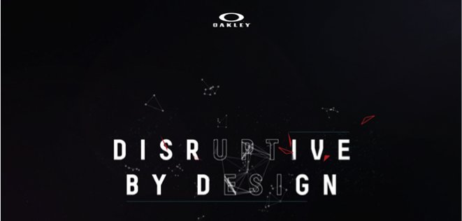
“An experimentally developed web platform housing content that explores the people, places and products behind the Oakley brand and it’s commitment to being disruptive by design.” Oakley’s space theme is rad, and mousing over their ‘Disruptive by Design’ logo creates mesmerizing intricate lines and patterns. Again, the scroll works with the content, and moving around causes the constellations to animate. The mobile site functions well too, retaining the animated logo and stars, and using an up/down scroll.
Hopefully these websites inspired you, like they did for us. There are so many more one page sites like this – go out and find some you love and report back!
Which one was your favorite? Any sites you’ve stumbled upon that we have to see? Let us know!
Until next time, Spicy readers!
